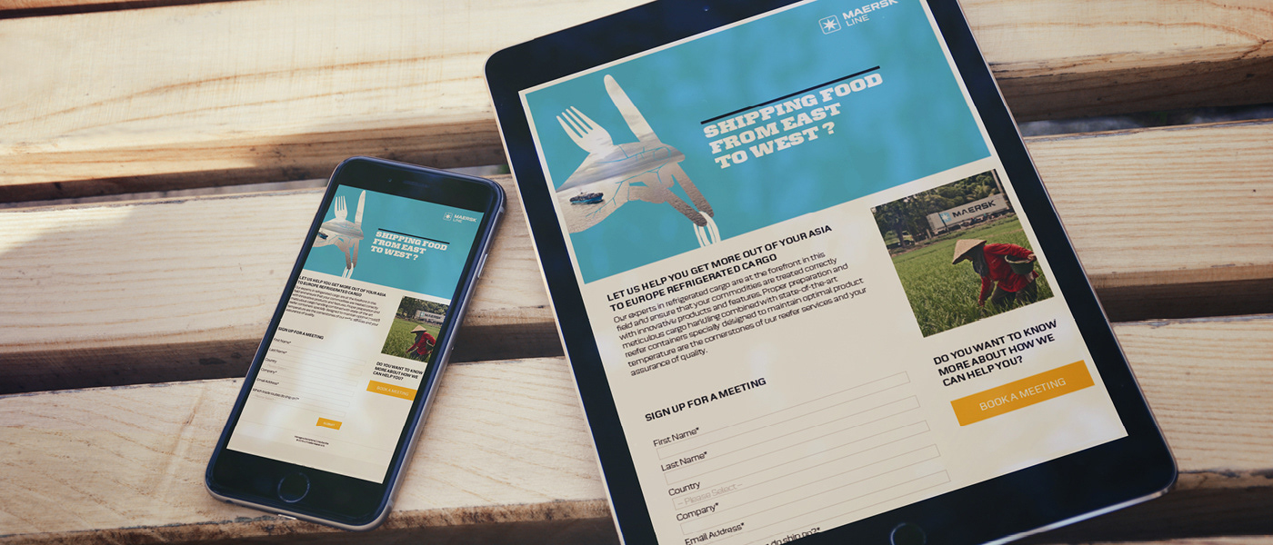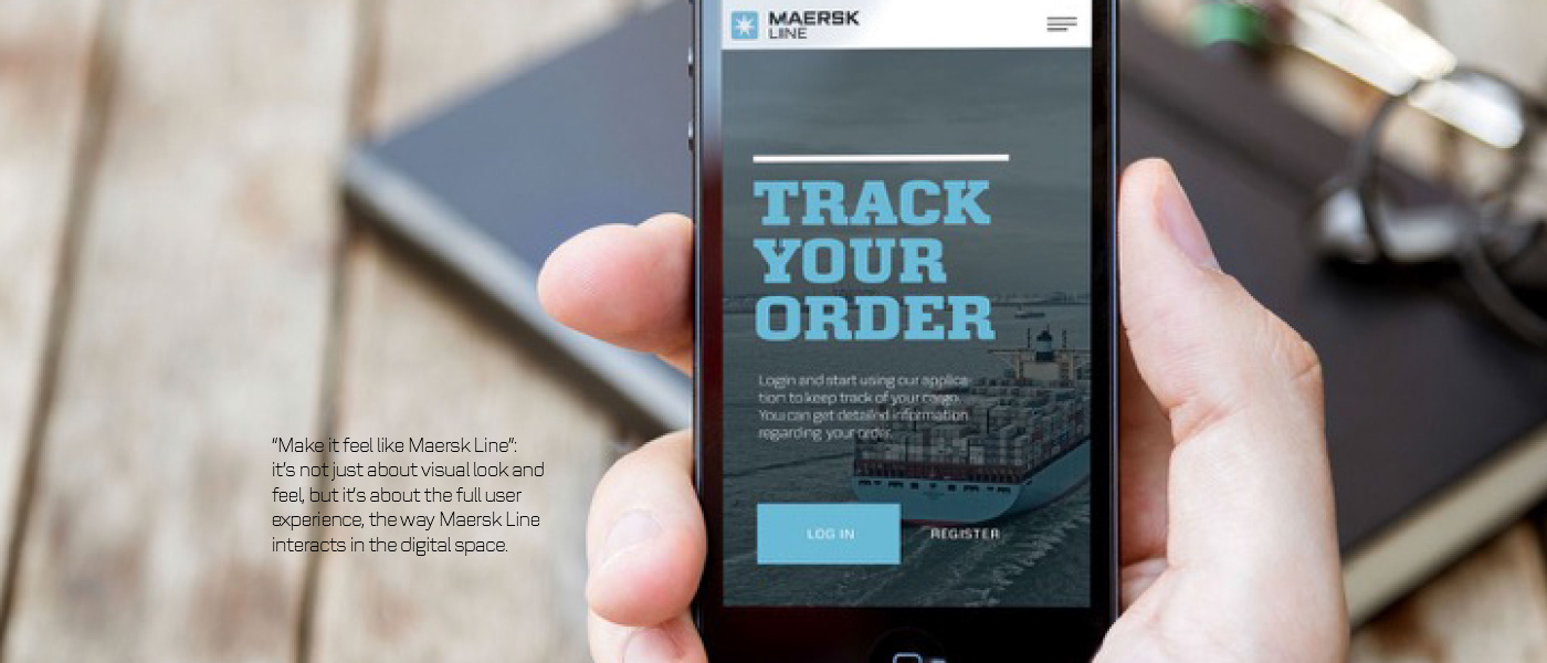

We have developed a new design that will give the recipient something to think about. The illustrative approach, together with clever headlines, combine a degree of crafty wit with powerful subject matter. This style supports, complements, but also softens, our USPs which otherwise could be too cold and complacent.
The large typography is key. It works as a way to enhance the visual hierarchy of the page by ensuring visitors read the largest type on the page first, because that is what grabs our attention first. The new design is not only an effective layout for graphics and typography, it has also – quite literally – multiple layers to be unveiled making it unique, intelligent and memorable.

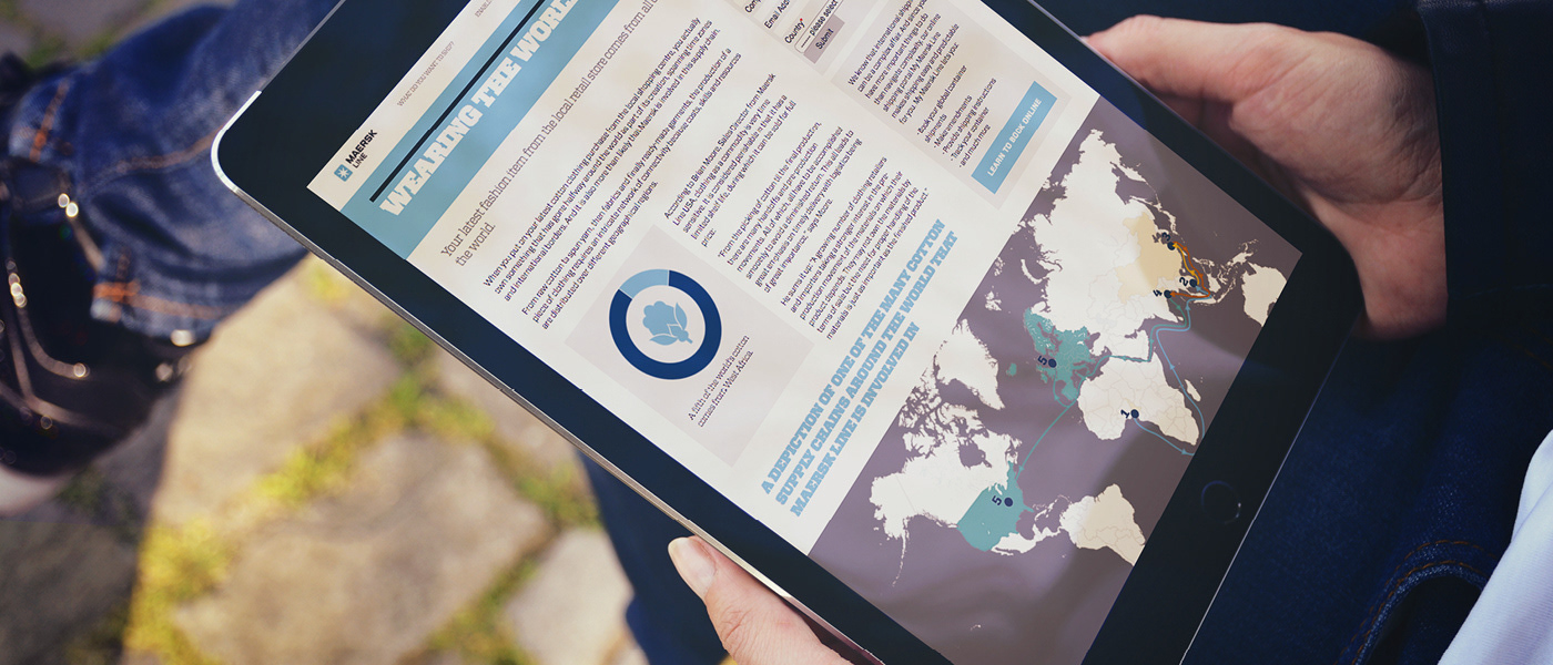
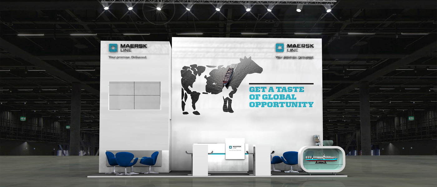
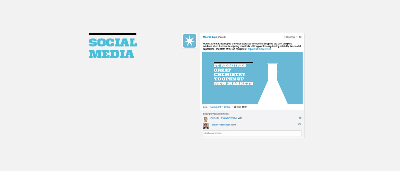
BLUE. IT’S OUR COLOUR
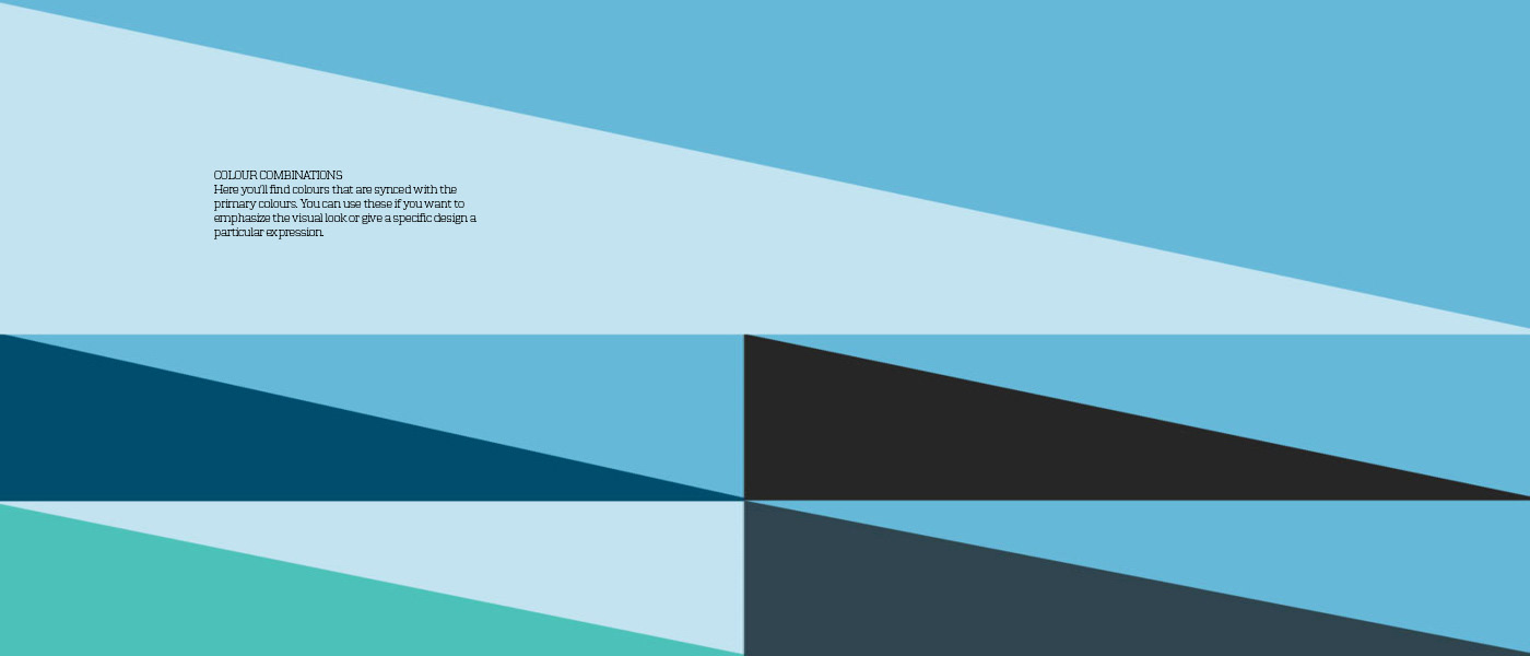
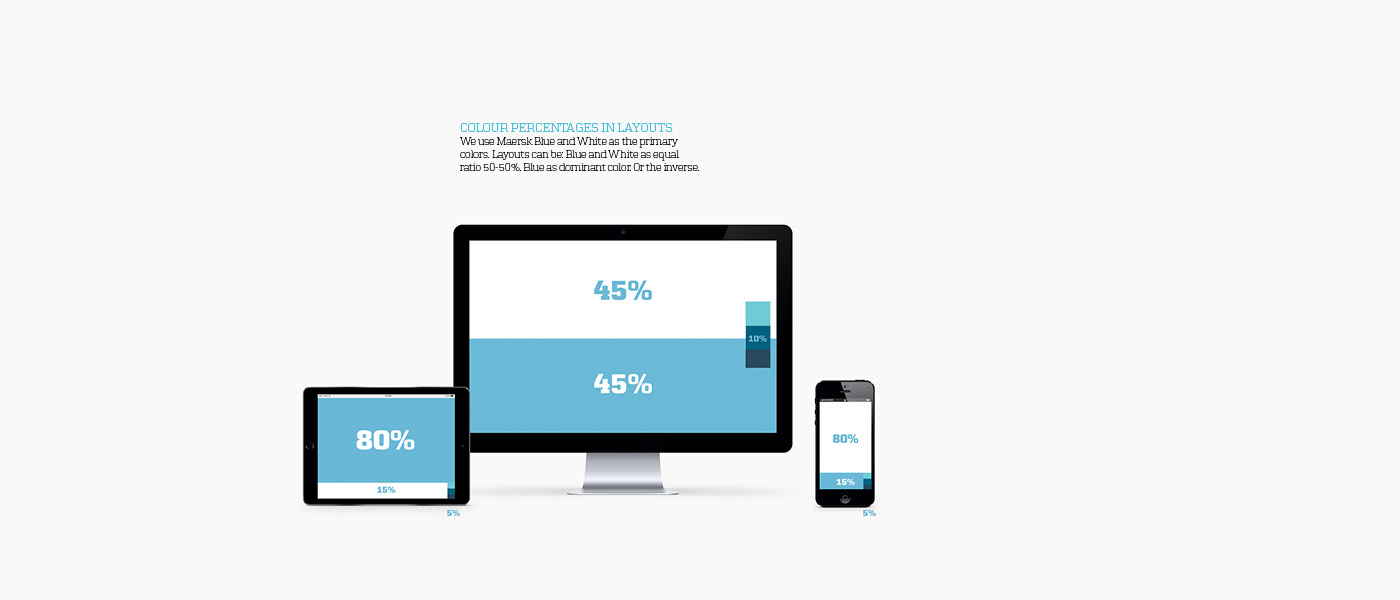
Blue is our distinctive brand colour, We love having big surfaces of flat monochromatic colour. Usually Blue sits on information’s top layer and white is the surrounding context. But Light Blue also likes to live in the background as big area.

Designing with lamina
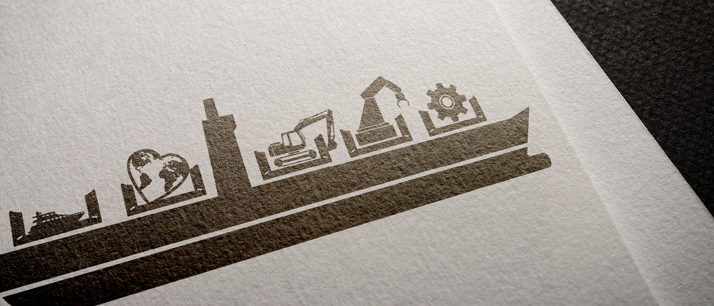
The brand look and feel consists of three main elements: our blue block colour, clever headlines and our new Lamina design – illustrations or shapes with a picture inside. The style is characterized by its playfullness.